From Consortium to ETS Foundation in three images and nearly 25 years.
Brand News, a porta that reports on the world of communications, media, and marketing, explains the transformation of the new logo of the Fondazione Mondo Digitale, created by Art Director Sergio Stenco.
We recommend you read the article [ Fondazione Mondo Digitale ETS rinnova il logo, simbolo di umanità al centro (in Italian)] and then revisit some of our historical milestones through the organisation’s logo.
Our first image was that of the Digital Youth Consortium-Consorzio Gioventù Digitale, the name with which our organisation began in 2001, an operative agency of the Rome Council. The logo, developed by a young Roman graphic designer, was officially registered together with the organisation between 2002 and 2003 with a simple description highlighting the issue of technology (the invention of the wheel) and digital inclusion: “a highly stylized image of human, in black, walk around a series of white, blue, and red concentric circles, bordered in black, and partially surrounded …”
In 2006, the logo had to be reviewed for the transformation of the Digital Youth Consortium into the Fondazione Mondo Digitale. The design of the new logo was assigned to Sorin Voicu, a young university student, who had recently graduated from one of the most innovative schools in Rome, the Einstein Technical Institute [see Project Sound & Image in Innovation in the Schools of Rome (in Italian)]. Sorin, of Romanian origin, who was introduced to us by Prof. Maurizio Pierantozzi, began collaborating with us as an intern in 2004 and ended up working with us until 2009.
The young designer faced a difficult task: drawing a logo that would evoke the main issues pursued by the organisation’s executive, first and foremost President Tullio De Mauro. The new word in the name “Mondo” (World) was introduced into the logo, transforming the concentric circles of inclusion into the fire of knowledge, the democratic knowledge society involving each and every individual as a civil mission. Sorin was inspired by the Myth of Prometheus and the contours of the world were rendered as flames, as knowledge, intelligence, and conscience: the building blocks of digital inclusion. The stylized human changed colour, while the concentric circles became a globe.
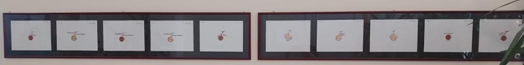
Sorin’s 2006 “narrative” logo was long-lived and accompanied us for 18 years, although it remained hard to reproduce its true meaning in low resolution and on a range of different media that did not highlight its colours and shape. The many drafts with varying positions and colours are still displayed at our headquarters in Via del Quadraro.
Sorin has moved on, and he currently is a creative director living and working in the United States. He has conserved his passion for technology intact and uses it to excitingly and passionately design products for his clients. He also collaborated with us shortly in 2011 to produce a video in honour of Tullio De Mauro, for our ten years of collaboration.
Time has elapsed quickly. We were not able to properly celebrate our twentieth anniversary due to the pandemic and the lockdown. However, in 2021, we began the transformation from operative to third sector agency with a new statute, a new governance, and registered with RUNTS (the national register for third sector organisations) in 2022. Last year was the first year we were fully operational with our new identity and a new website, conserving the same logo and colours, albeit with renewed graphics and content. In May, we presented our first “5 x 1000 tax” campaign. So, the need for a new image could no longer be delayed. We were inspired by the principle of simplicity, “subtracting the obvious and adding the significant.” And so the new logo was born – as described on the portal at Brand News – with the slogan “Right to Knowledge” becoming an integral part of the image, thanks to the work started by Creative Director Paolo Iabichino.
Now, our human is markedly stylized and placed in the circle of the world. He is welcomed, included, involved, and integrated. And this is how we must all feel: part of a greater design.


